HOMER Website Rebrand
2020 - 2021
OVERVIEW
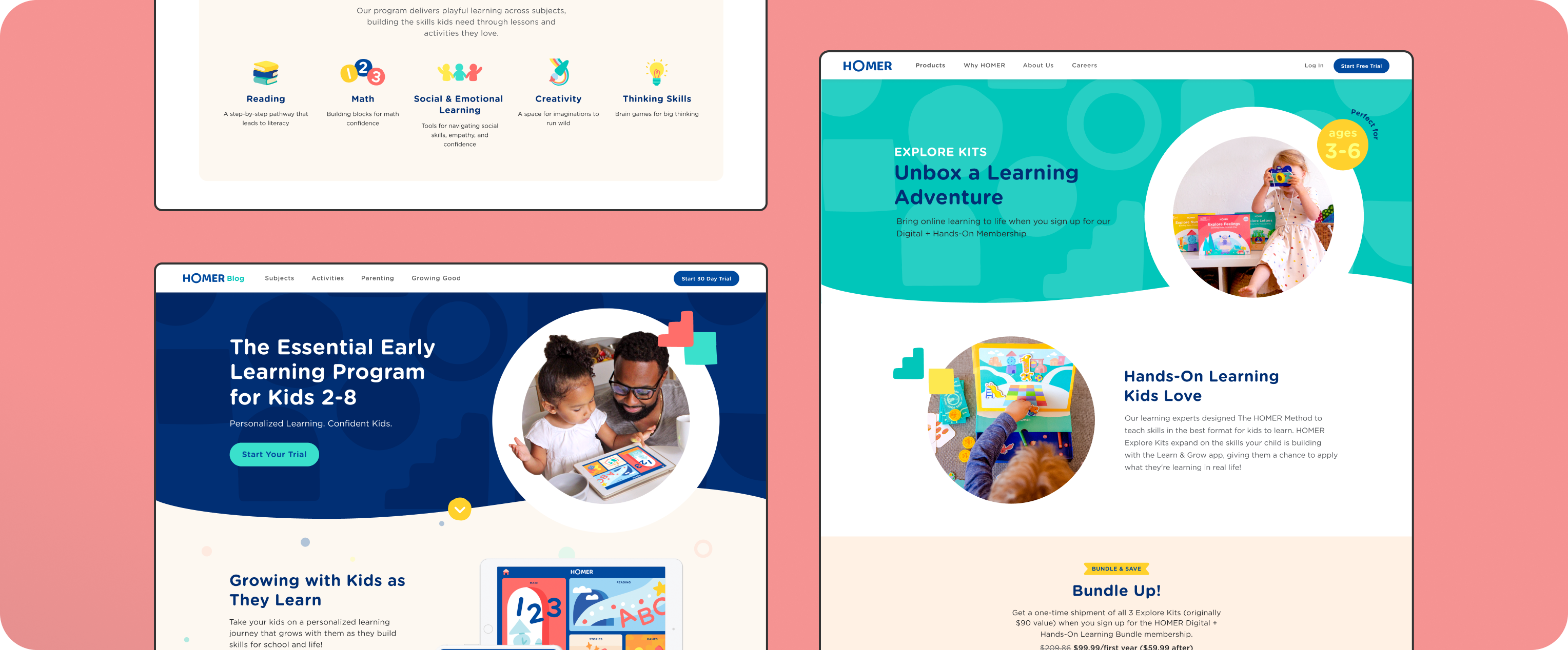
As part of HOMER's rebrand, we designed major website pages to support the rebrand rollout as well as new product launches. We translated the brand creative team's guidelines into reusable and scalable product design components and templates.
ROLE
Product Design, Design System, Research, Strategy
The Goal

HOMER's Brand Creative team created a fresh new brand direction with a new color palette, key brand elements and illustration assets. From there, we collaborated actively to translate the direction into scalable product design components.
With a junior designer and a product design director, I led all major website page redesigns and collaboration with developers during implementation.
The Results
Enabling Revenue Strategies
After 3 months, we built a stronger website that reflected our new branding and product offerings to more effectively support new acquisition strategies. These improvements created a foundation for our recent subscription plan launches that led to increased Convert to Pay and Annual plan adoptions to drive lifetime value of our customers.
Foundational Web Systems
Collaborating closely with our engineers, we used this redesign to make major improvements to our foundational systems like grids, typography, and spacing. This allowed us to design and build new pages more effectively.
Streamlined Process
In the beginning of the project, we noticed a lot of inefficiency and lack of clarity around deliverables and deadlines when working with stakeholders and partners. To improve this, product design created a collaboration and feedback process and worked closely with project managers to pilot. It wasn't perfect by any means, but it paved way for iteration that led to a more effective process we now have today.
Homepage
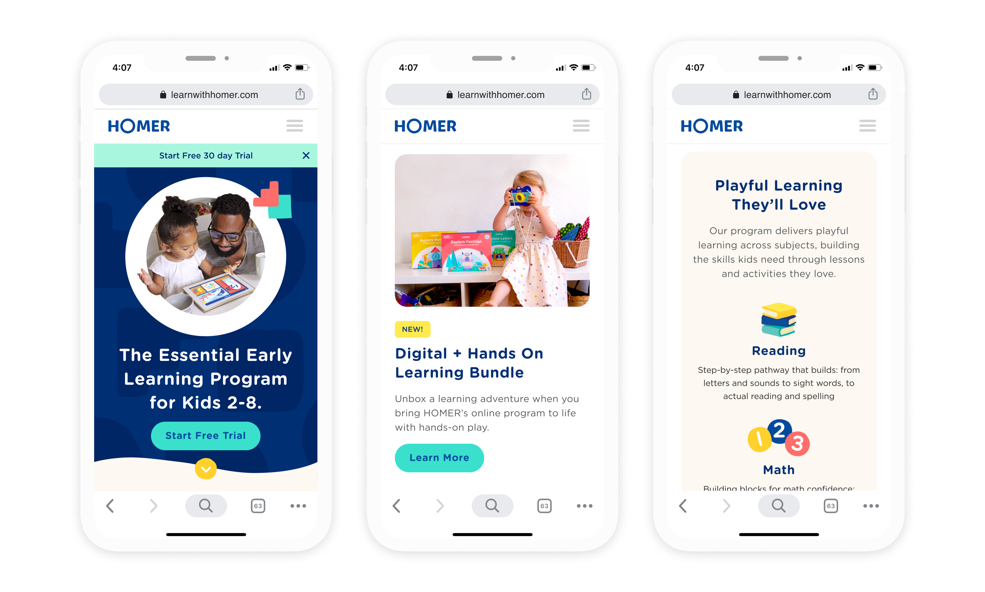
Our goal for the new homepage was applying the new visual brand guidelines to put forward a strong and updated brand, and communicating our suite of product offering in a clear way.
As much as it was a highly political page, I worked closely with our brand partners and a number of stakeholders to create an experience that aimed to increase major site metrics.


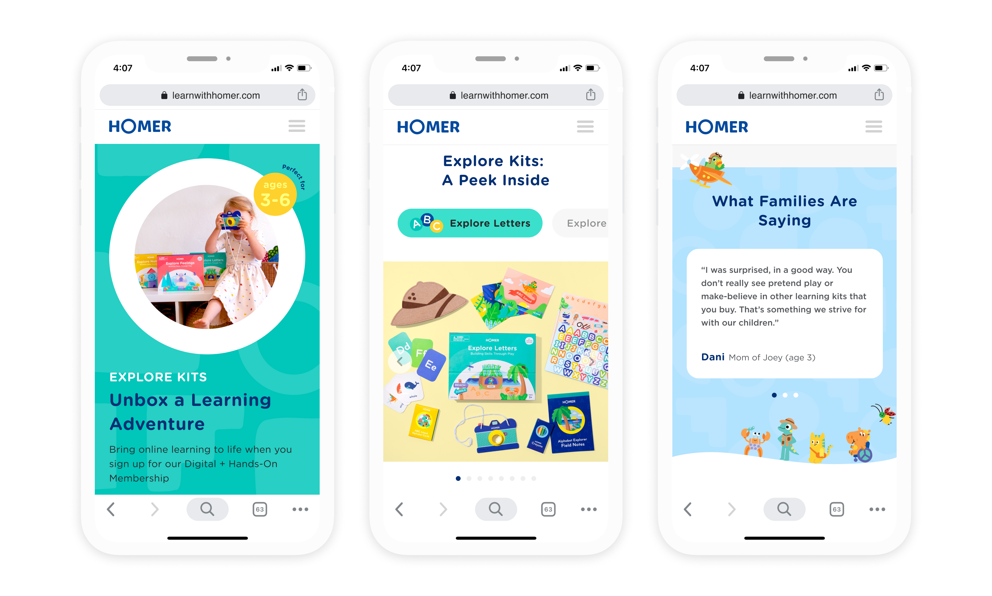
Explore Kits Launch Product Page
Working closely with our physical kit designers and the marketing team, I designed a product page where I designed new components from scratch like the product detail carousel.


Web Components

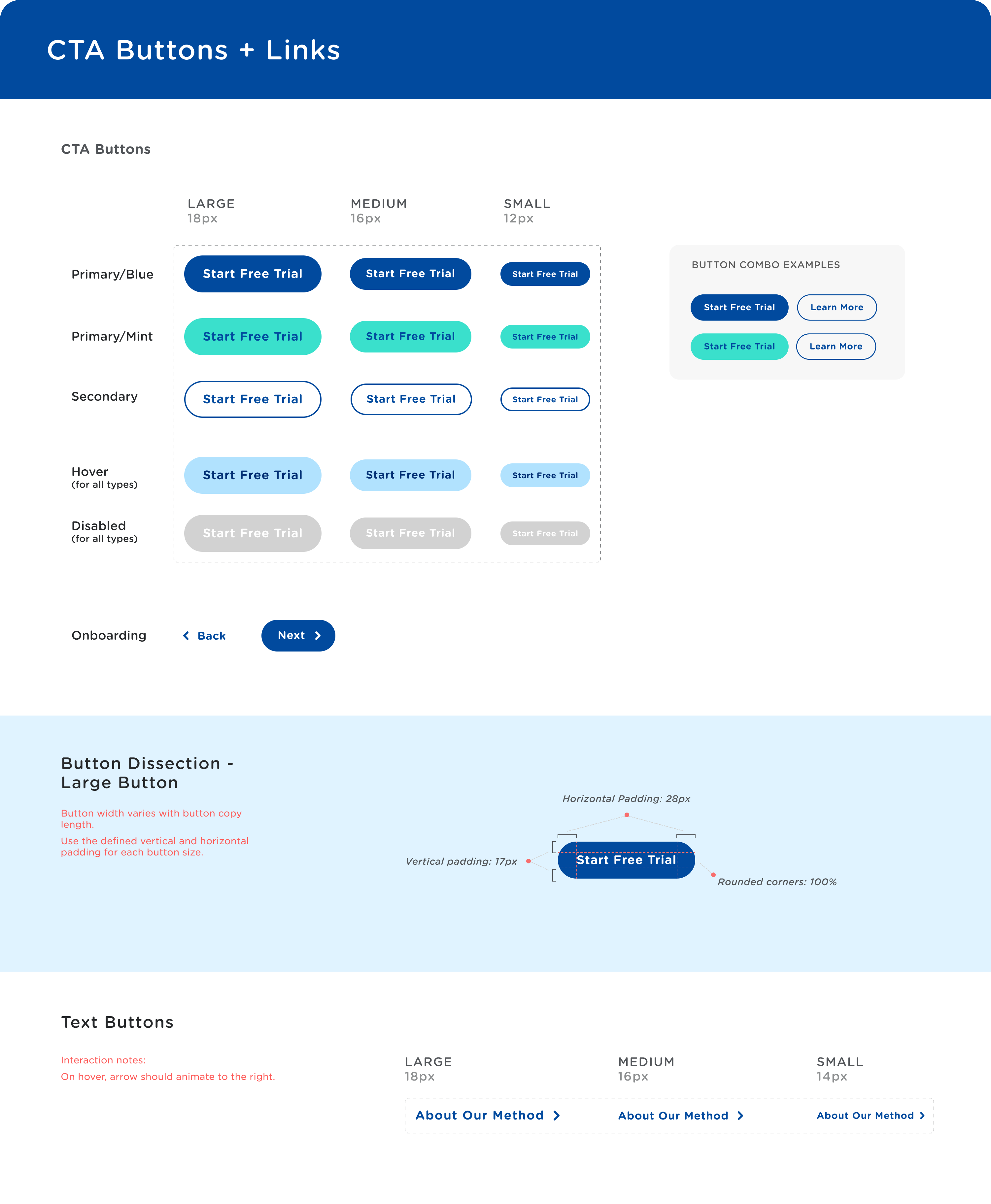
After stress-testing the buttons with the new colors and styles, we created a new system of buttons with guidelines for usage and implementation.
I was in charge of maintaining and updating the internal Figma component library and creating developer documentation to facilitate the site-wide change rollout.
