HOMER Web Dashboard
Late 2021-Mar 2022
BRIEF
HOMER's dashboard experience was outdated both visually and functionally, and didn't allow users to easily manage their accounts and subscriptions. This resulted in a high volume of customer support tickets and negative reviews on app stores.
ROLE
Lead Product Designer
TEAM
Ashley Mannetta (PO + UXR), Peter Richter, Alejandra Beltramen, Peter Lenahan (Engineering), Chloe Cheau, Wing Sang (Data)
THE PROBLEM
Oh boy, where to even begin!
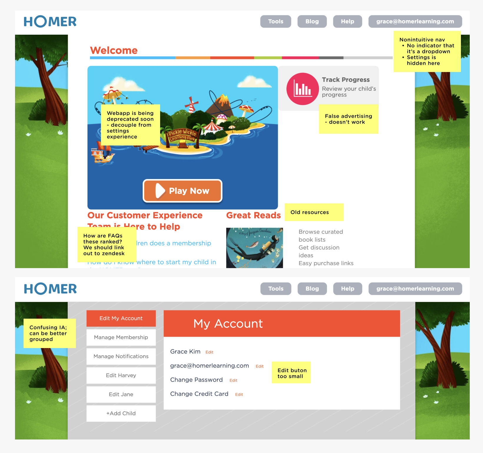
HOMER's web dashboard, the first critical touchpoint of web users, was visually and functionally outdated. From showing inaccurate membership details to lacking basic account management features, it contributed to a high volume of cx tickets and negative reviews that hurt our brand.
DEFINE
Design Principles
To help guide the project and drive alignment within the team, I created a set of design principles with my Product Owner following stakeholder interviews:
1. Transparency to build trust
Display accurate membership details and clear cancelation instructions.
2. Allow easy self-servicing
Leverage best UX practices and intuitive design patterns to allow users to easily manage their account on their own.
3. Scalable and flexible foundations
We need a design that can support new product offerings and features that will emerge with our evolving brand.
DESIGN SOLUTIONS
01 Navigation
Streamlined Categories
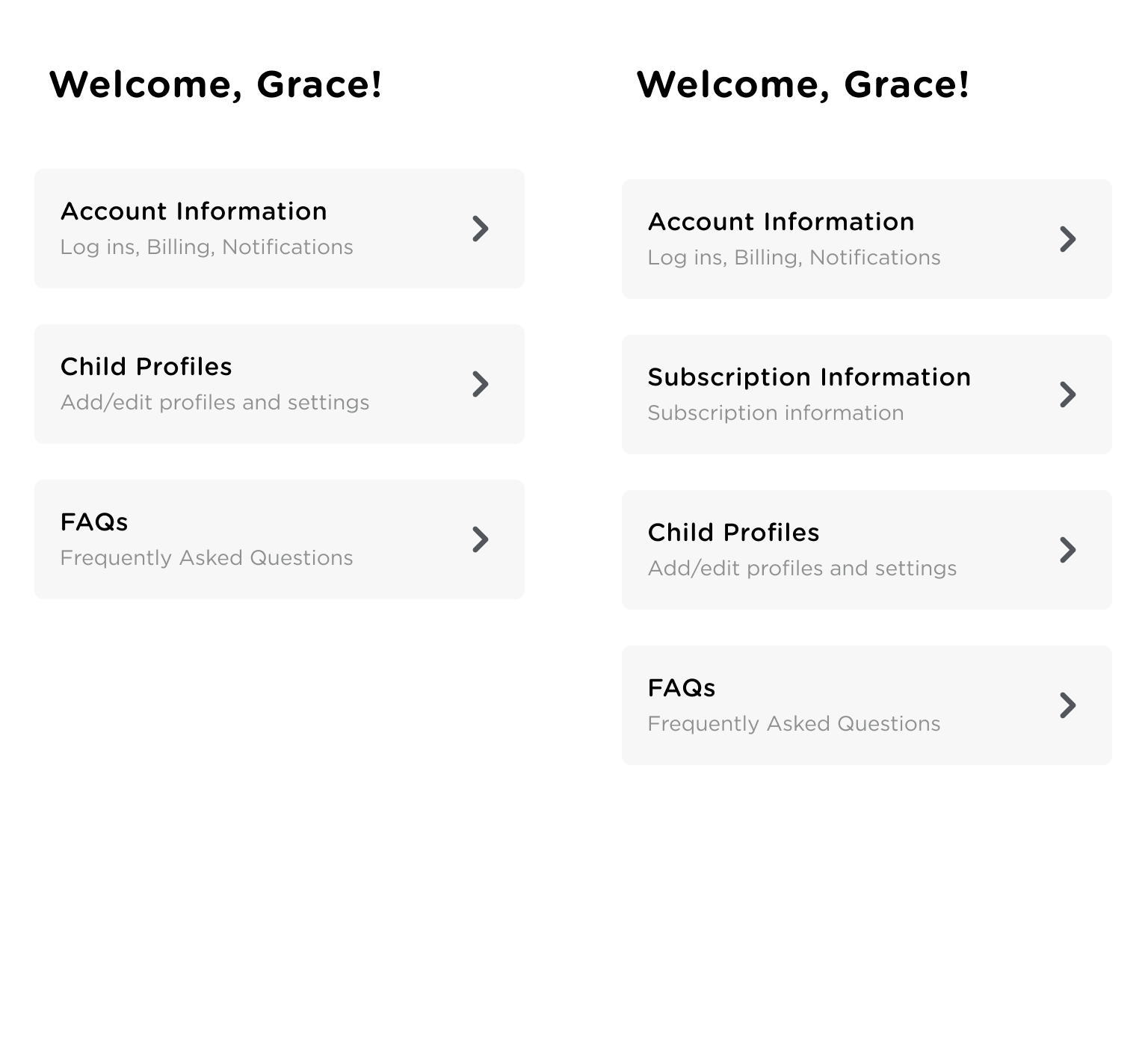
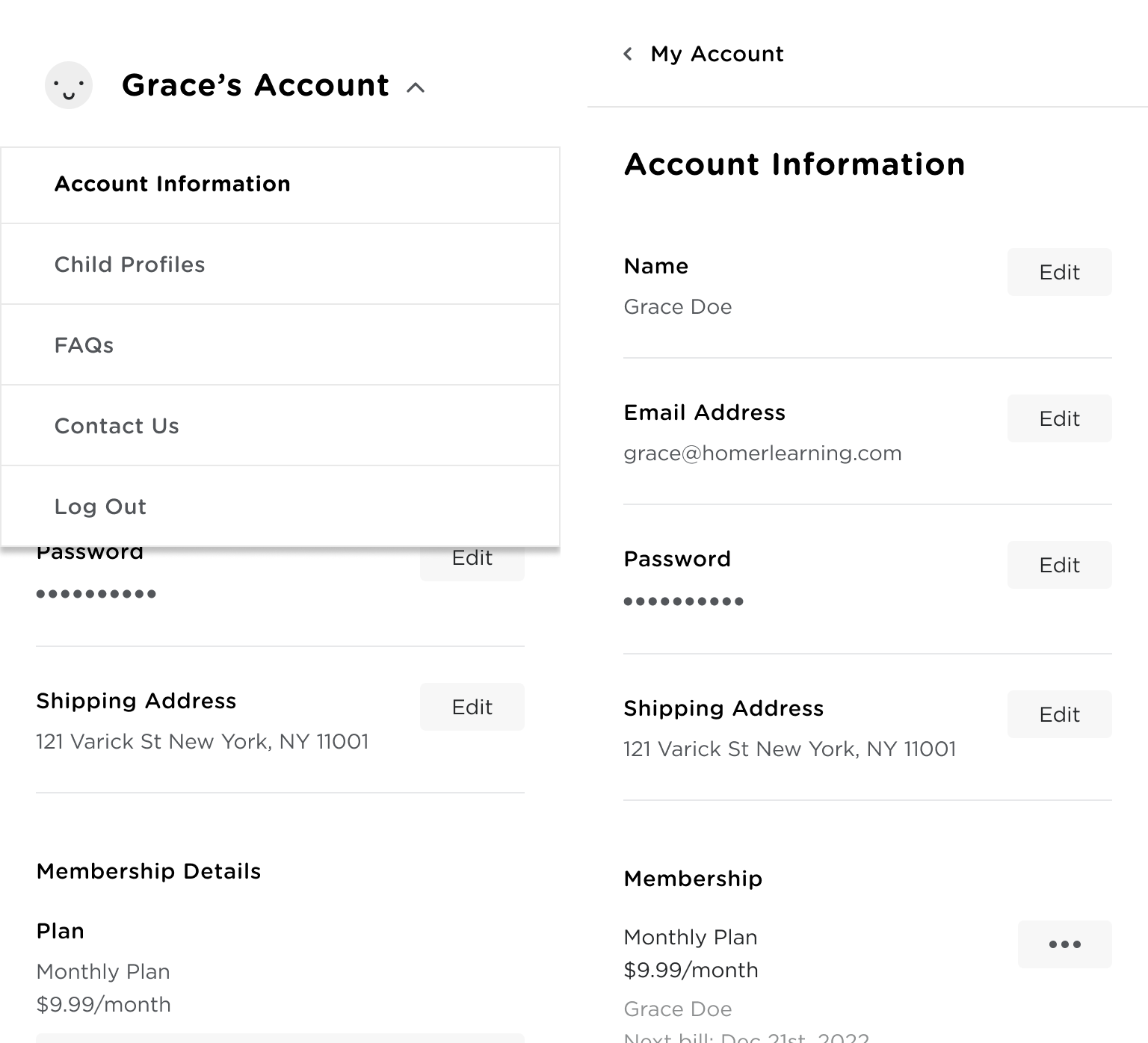
We user tested a few information architecture concepts to arrive at a clear and streamlined option to help users to easily find what they’re looking for. We learned that using less categories and more inclusive categories (left) resulted in higher task success rate.
Optimizing for Mobile
For mobile, a bread-crumb navigation menu proved to be a more familiar navigational element than a persistent dropdown menu. We also tested the bottom sheet UI instead of a full screen modal or a separate page, to keep the hierarchy shallow for users to easily navigate around.

02 Modular Layout
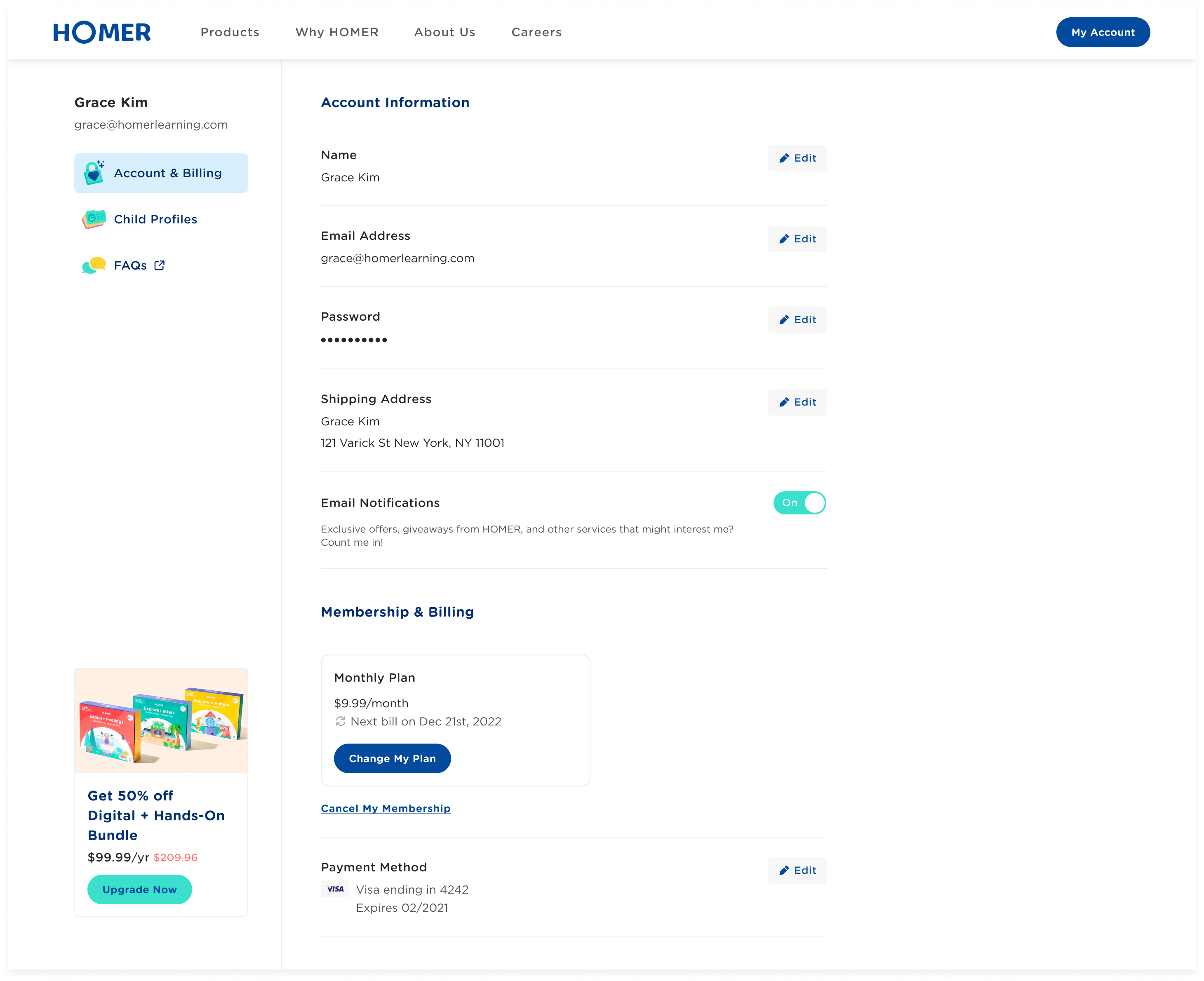
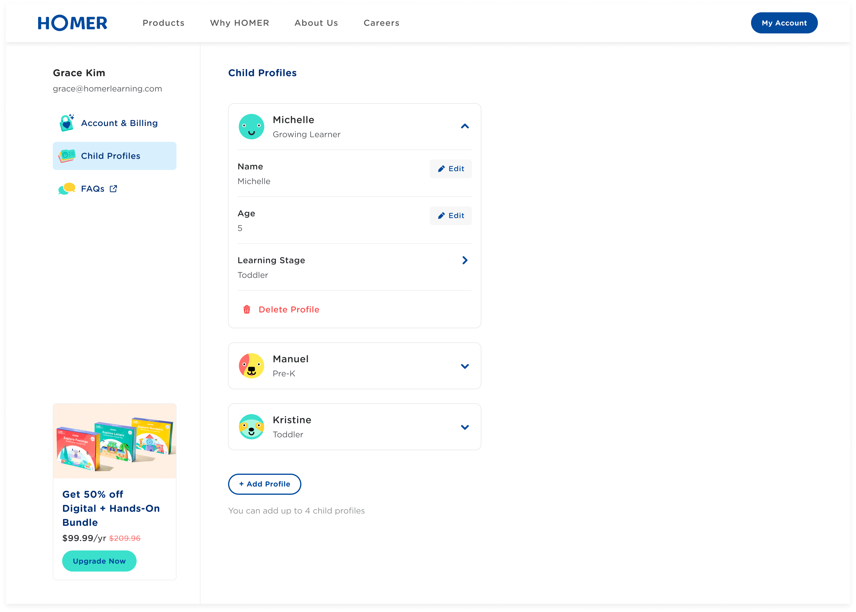
With our evolving product offerings, we needed a scalable platform that allowed us to introduce new features and promo modules. I used modular layouts on all breakpoints to ensure we were able to easily swap menus and content without creating inconsistencies to the layout.

03 In-context editing
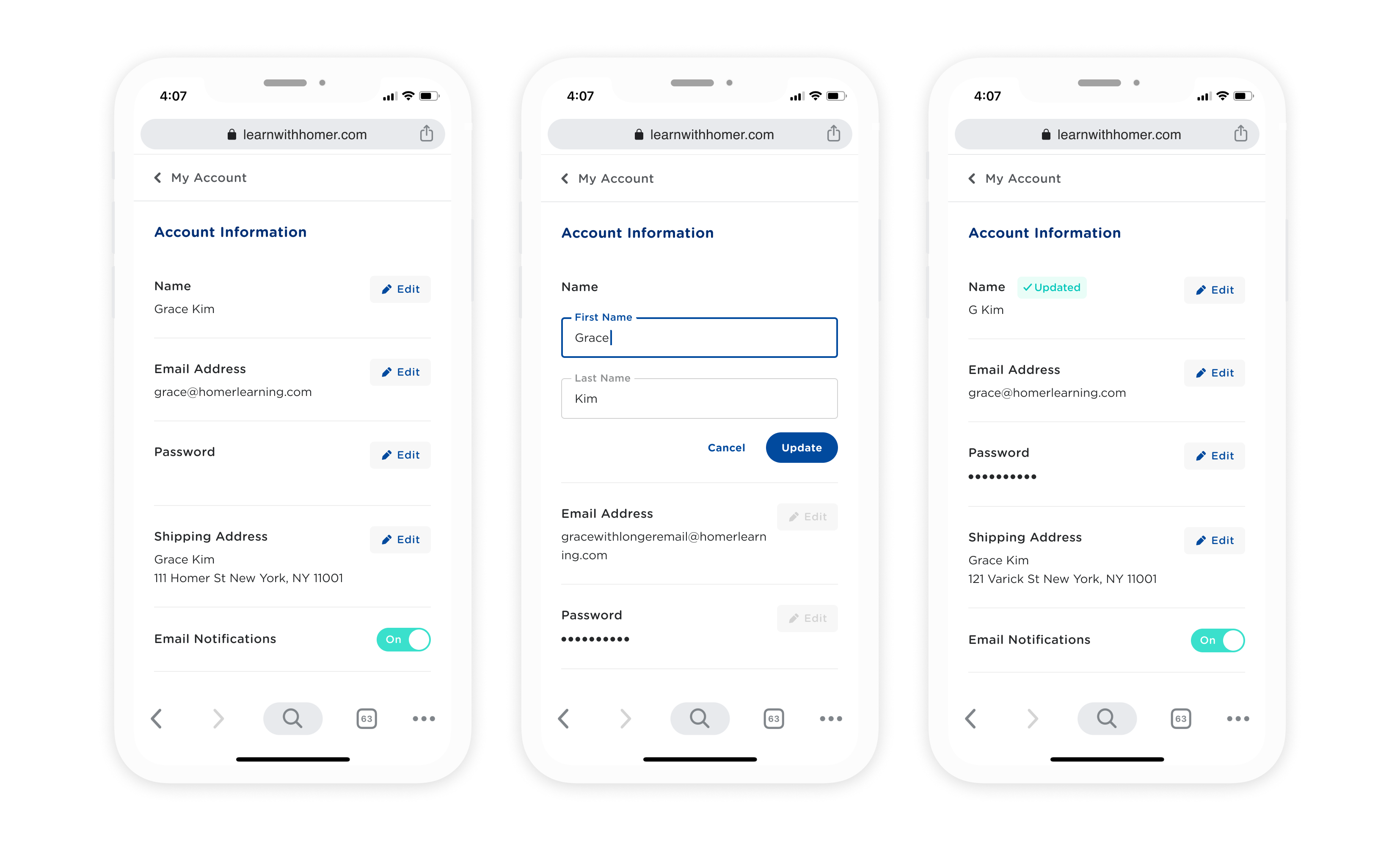
The original design forced users to open a modal for each input in order to edit their information. To keep users in context during editing and increase efficiency, I used an inline editing functionality that allows users to edit their information directly from the same page.
A concern we uncovered with user testing was users forgetting to save before moving onto another input. To solve for this, I disabled other edit buttons to indicate to users that the current action must be completed to switch tasks.
04 Flexible membership module
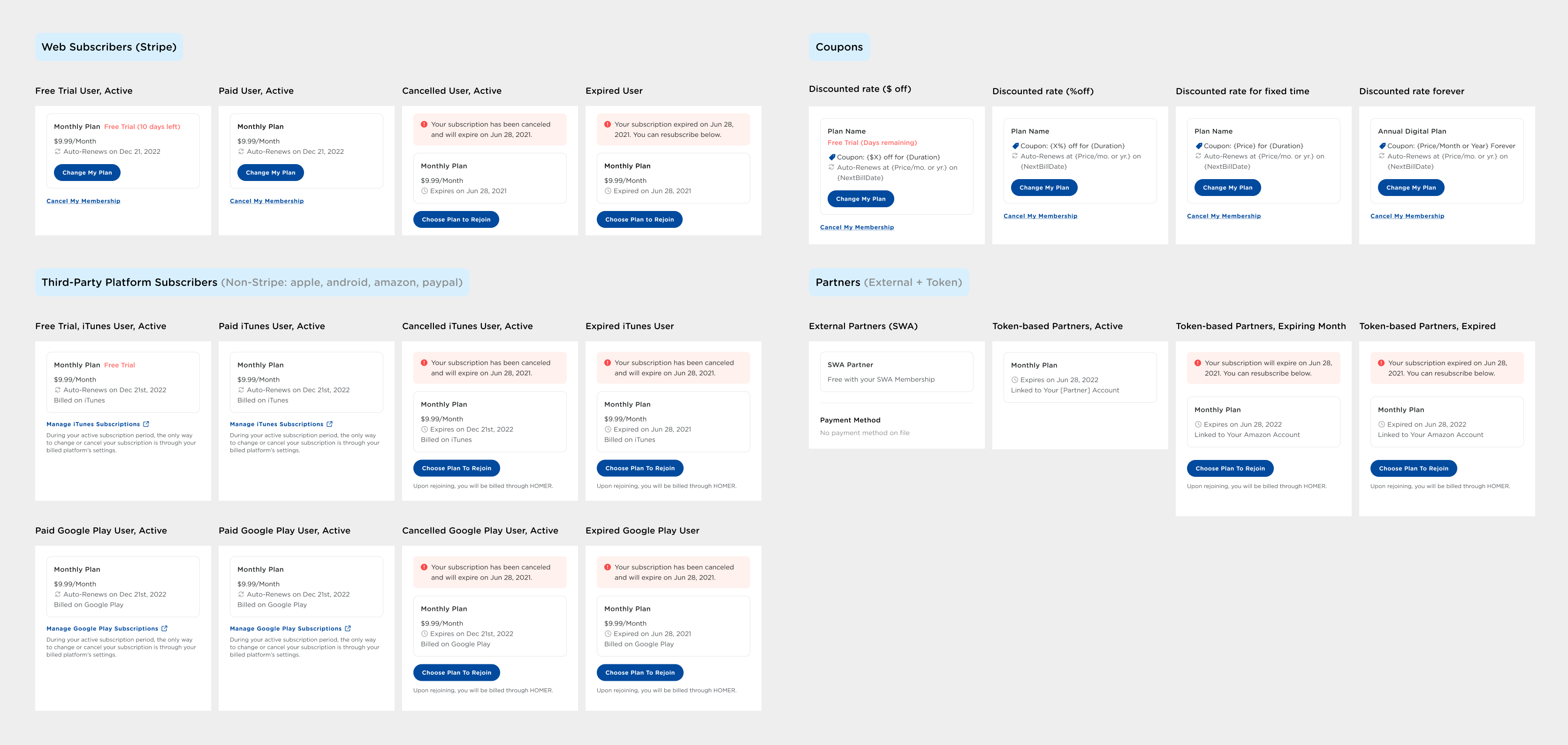
One of the most challenging part of this project was creating a membership information display logic that supported all use cases. I worked closely with developers and QA analysists to identify and create a flexible system that worked across all different account status, plan types, billing source, and billing schedules.
Implementation
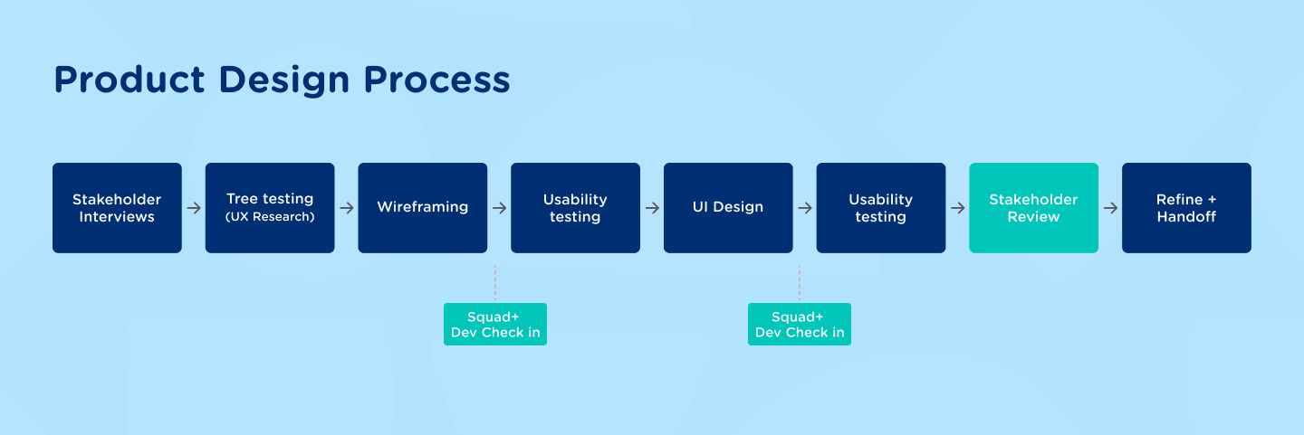
During planning, I built in several check-ins with our developers into the process to ensure that important details were not missed. This also allowed our developers to anticipate for requirements that involved larger teams including backend and data.
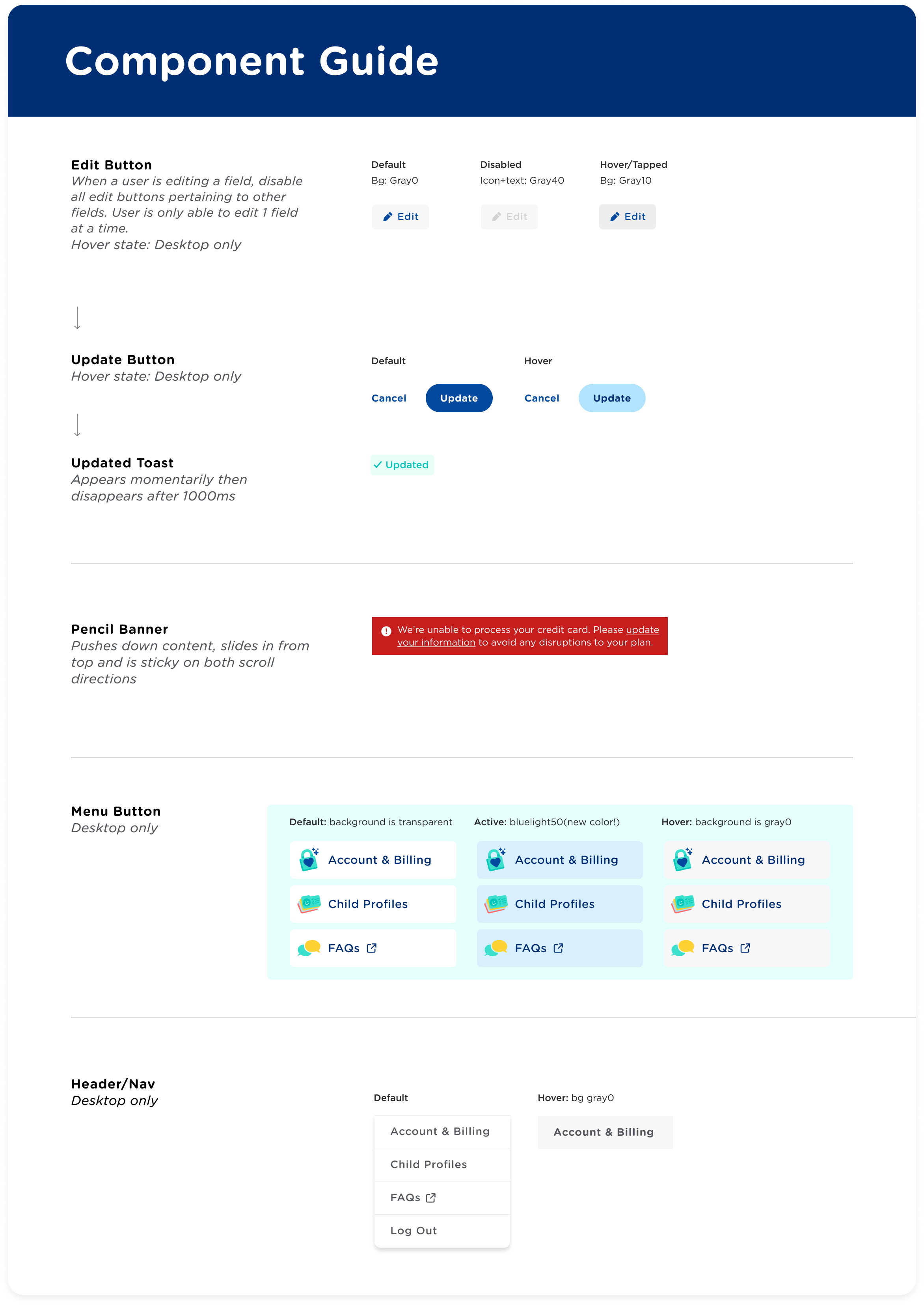
In the refinement stage, I created detailed documentation to provide clarity with design elements and behaviors. I'm passionate about creating a seamless developer-designer relationship by actively collaborating with them before and during the implementation process.
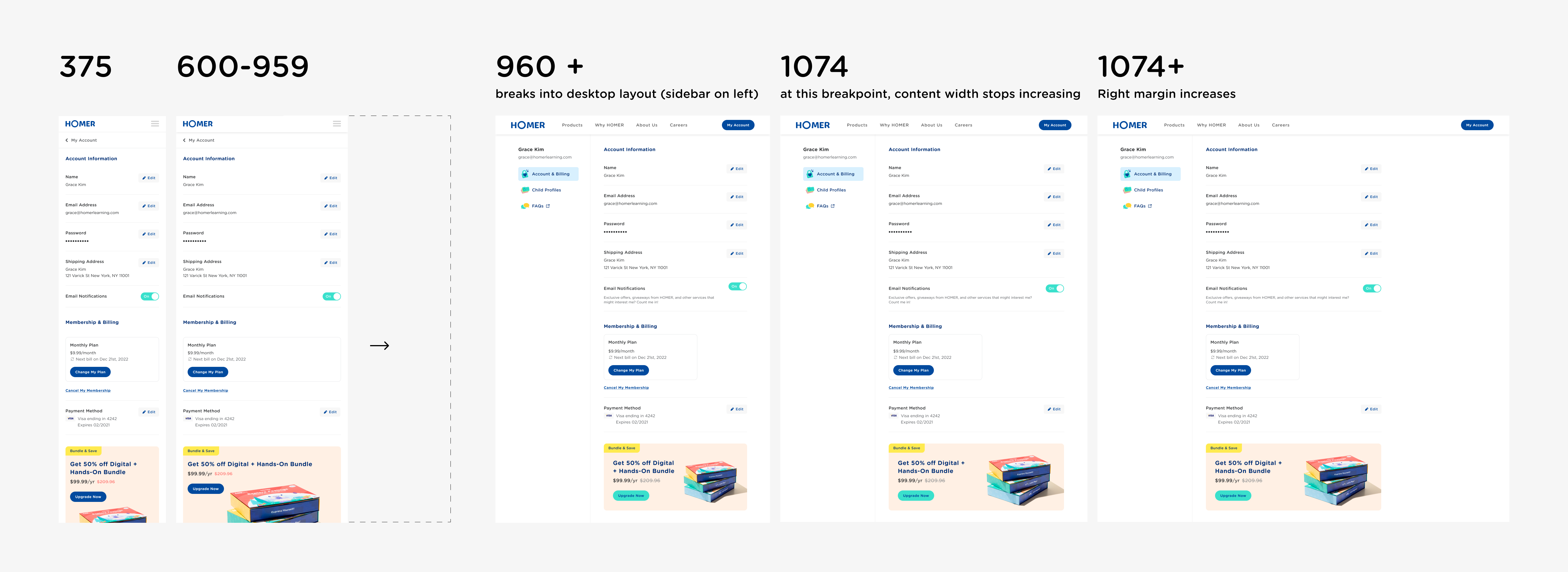
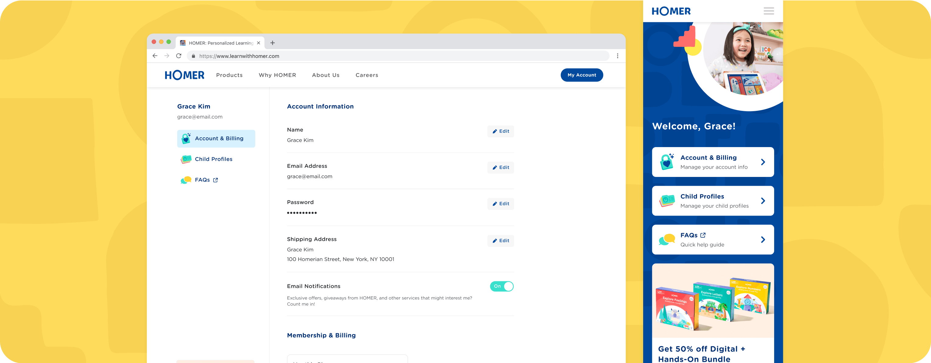
Responsive web design mock ups

