Strava Subscriber Experience
2023
BRIEF
As a growth designer for Strava's monetization team, I worked cross-functionally to design and test both smaller optimization tests and larger subscriber activation initiatives.
ROLES
Product design, A/B testing, usability testing, workshop, strategy
PLATFORM
iOS and Android App, Website
PROJECT 01
Subscriber Onboarding
CONTEXT
The current Strava subscription didn't have a way to properly connect users to pro features, rendering a number of unique features buried, confusing, and irrelevant.
As a team, we hypothesized that a proper onboarding process would help better connect new subscribers to relevant pro features and drive engagement.

DISCOVERY
Why are new subscribers not properly activated?
Our research team ran online surveys and 1:1 interviews with former subscribers to understand the subscription experience and users' pain points.
Key Insights
1 Most churned subscribers attributed features not being aligned to their goals as primary reason for churning
2 Unclear delination between pro and free features meant subscribers were not easily seeing the value of the subscription
3 Pro features were generally perceived as confusing upfront
OPPORTUNITIES
Where are the gaps?
After a full audit of the current journey as a new subscriber, we identified following 3 key areas for our solution:
Feature education
Pro features are hard to grasp in and of itself. While ultimately we should make the feature themselves intuitive, what ancillary measures can we take to properly educate new subscribers?
Feature grouping
We saw that not all features are relevant to users depending on their intent and goals. To help make this journey more relevant and simplified, how can we sort them into relevant categories?
Clear delineation
We heard loud and clear that subscribers needed to be reminded of the value they are getting out of the subscription by being able to see what features they now have access to.
SOLUTION
A more relevant and engaging onboarding process for subscribers.
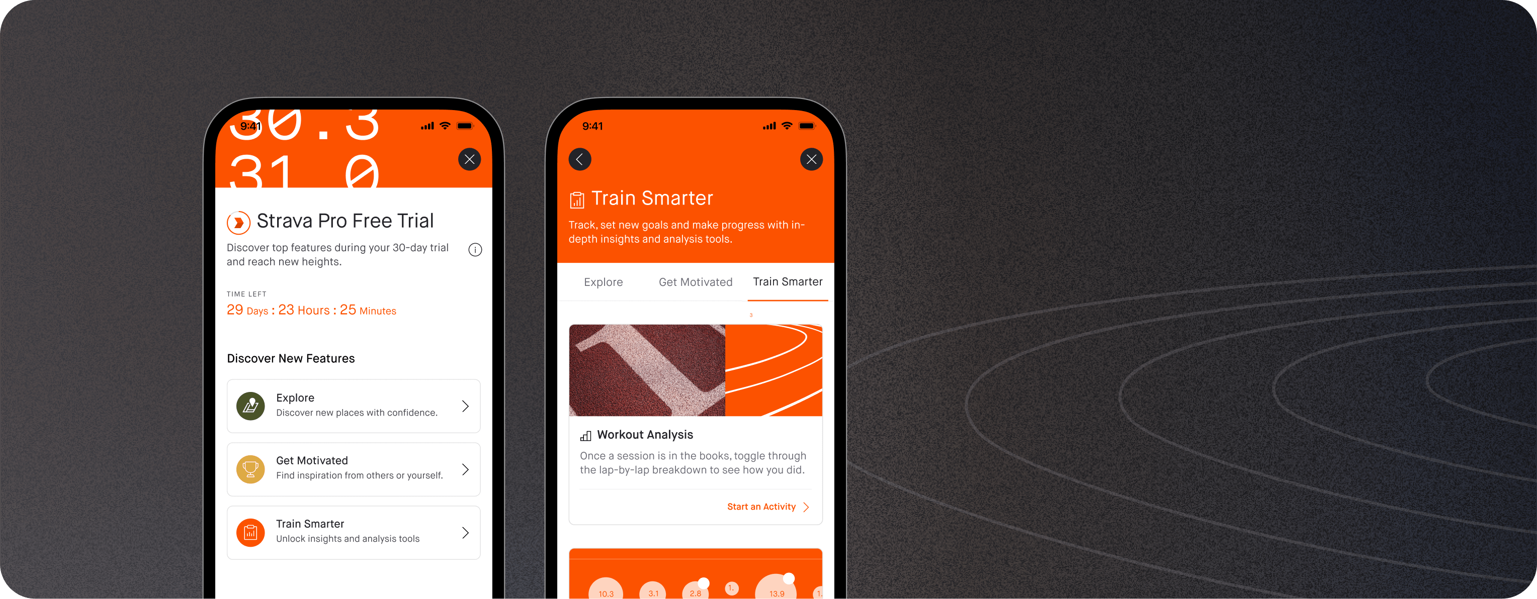
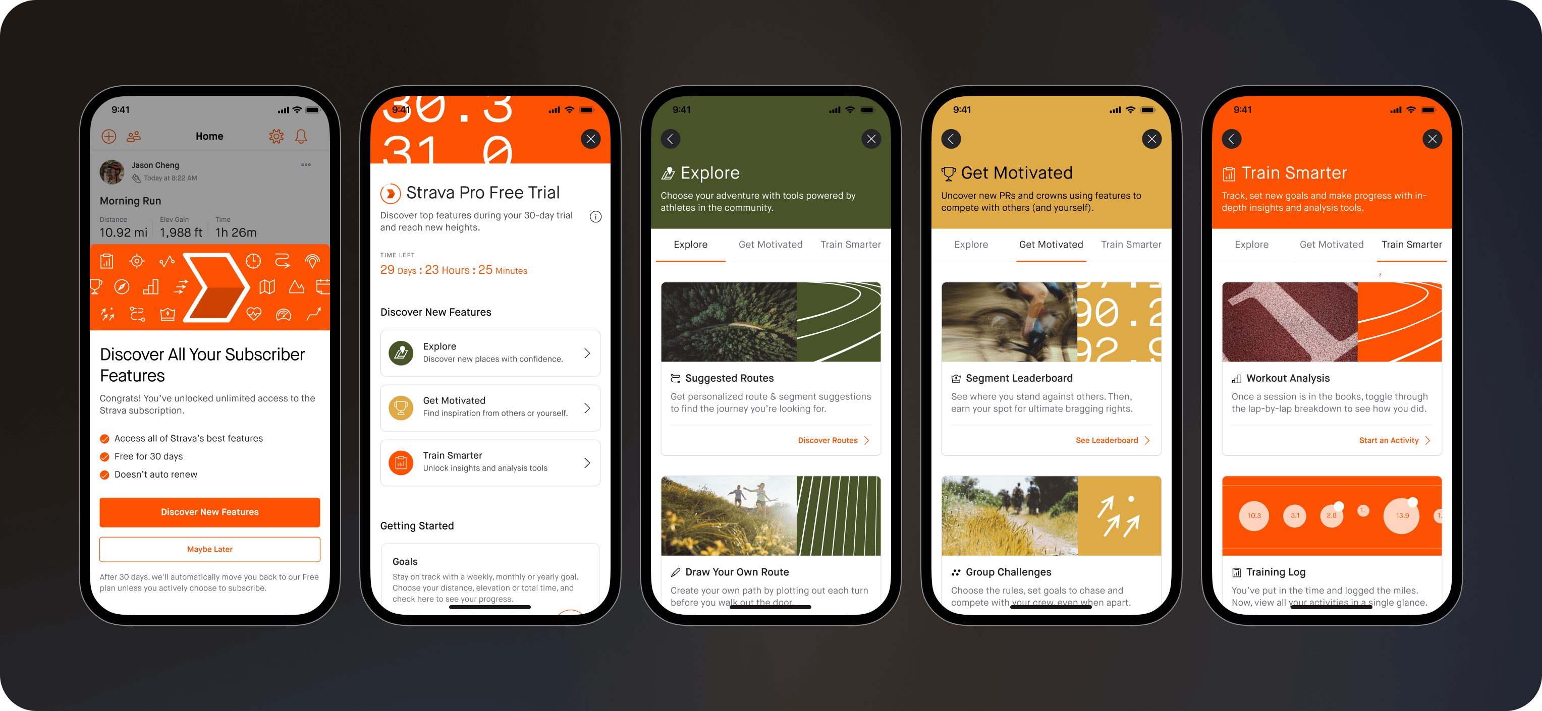
We organized our pro features into 3 buckets according to the top user goals we identified. From there, we baked in dedicated feature education in the flow to guide the user.
After rounds of user testing and internal reviews, we collaborated across the marketing, PMM, and engineering teams to create an engaging experience for our first time subscribers.
HIGHLIGHTS
Digestible and actionable
Our main focus was making the navigation clear and the educational content digestible at this point of the journey. I worked closely with our copywriter and brand designer on the copy, color scheme and visual assets.
HIGHLIGHT
Being a good guide
Once users were exploring the features for the first time, they were presented with light feature education coachmarks and tours. Striking just the right balance between too much and too little education was a challenge we had to work through.
FUTURE STATE
A personalized subscription hub
On top of the first subscriber onboarding flow, we identified a need for a more persistent subscription hub. This was to carve out a more permanent and dynamic space to ensure continual feature awareness & education to both old and new subscribers.
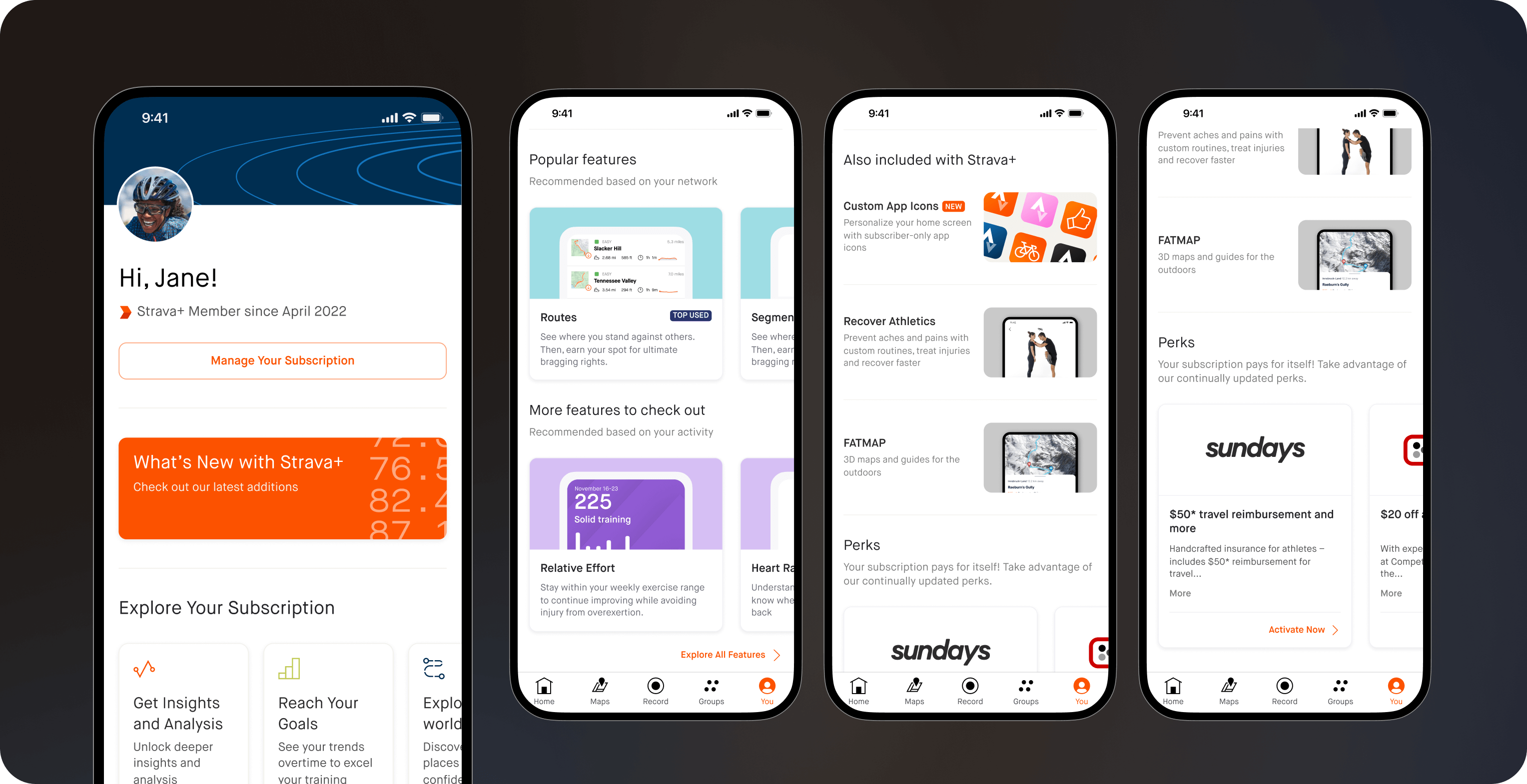
The new subscription hub aimed to surface more personalized information based on users' preferences and activities.
PROJECT 02
Subscription Management Tools
CONTEXT
Many of Strava's subscription management tools necessitated a redesign or brand new design and development processes. As a newly focused area for the company, I worked on a number of initiatives to support the subscription goals.
*Below are very brief highlights of the projects I worked on during my time there. In-depth case studies are available upon request.
01
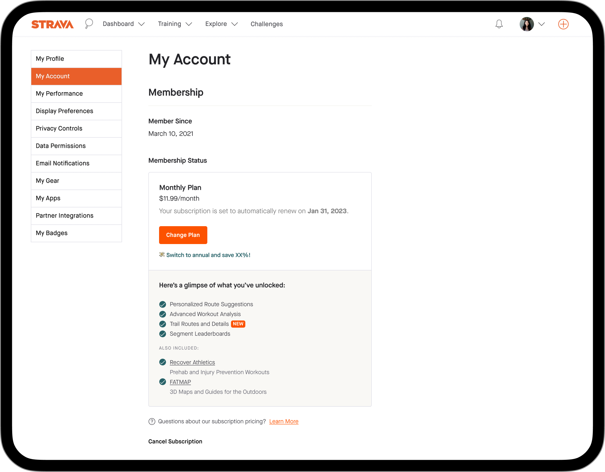
Account Page Redesign
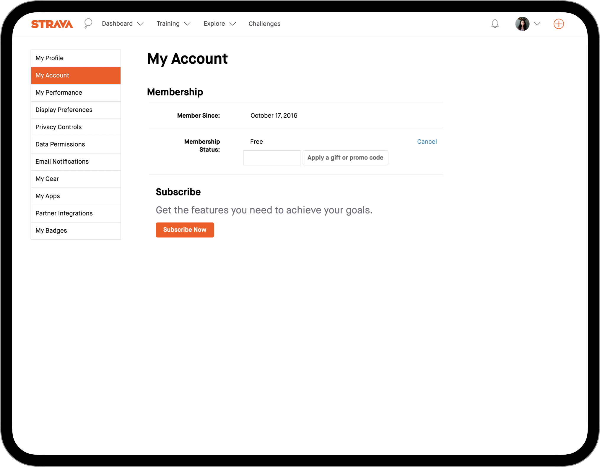
The original page was created by developers with minimal designer involvement and needless to say, was ridden with areas of improvements. Mainly, the 2-column layout was not well suited for smaller breakpoints and didn't have visual consistency across typography and spacing.
On top of cleaning up the page's layout, typography and spacing, I added a more distinct treatment to the membership information. This allowed users to easily locate and manage their subscription, as well as give us space to be more creative with upsells and value reinforcements.
02
Plan Crossgrading Flow
I designed a new contextual way to change plans within the settings page. This was a brand new functionality to introduce on the website and involved a lot of back and forths with engineers and rounds of internal QA testing.
03
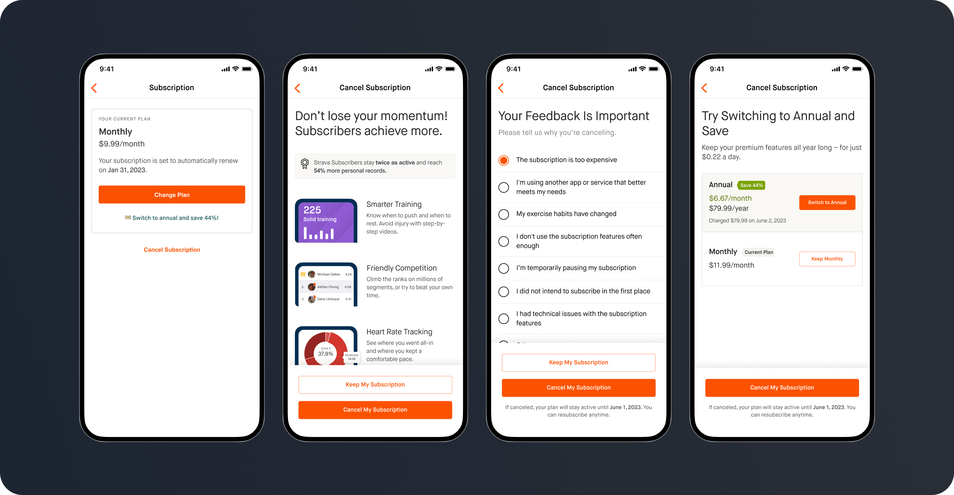
Cancelation Flow
The original cancelation flow used a one-size-fits-all approach that lacked personalization based on reason for cancelation, as well as a seamless, on-brand experience.
As part of the first iteration of the revamp, we created an experience that included value reiteration and selection-based paths.
CHALLENGE
Balancing the directly-competing user goal to cancel easily, with that of the business to retain users, resulted in some heated debates about the information hierarchy and interaction patterns with a few stakeholders.
Despite the business case for it, I didn't want to prioritize short-term gains over trust, especially if the impact is likely due to a dark UX pattern. I ultimately felt that once user is in the cancel funnel, their primary goal is to cancel, and we should honor that with clear and straightforward UX.
The next iteration of this project will include surfacing user-specific data about their most engaged features and key moments in their fitness journey to memorialize their tenure as subscribers.
